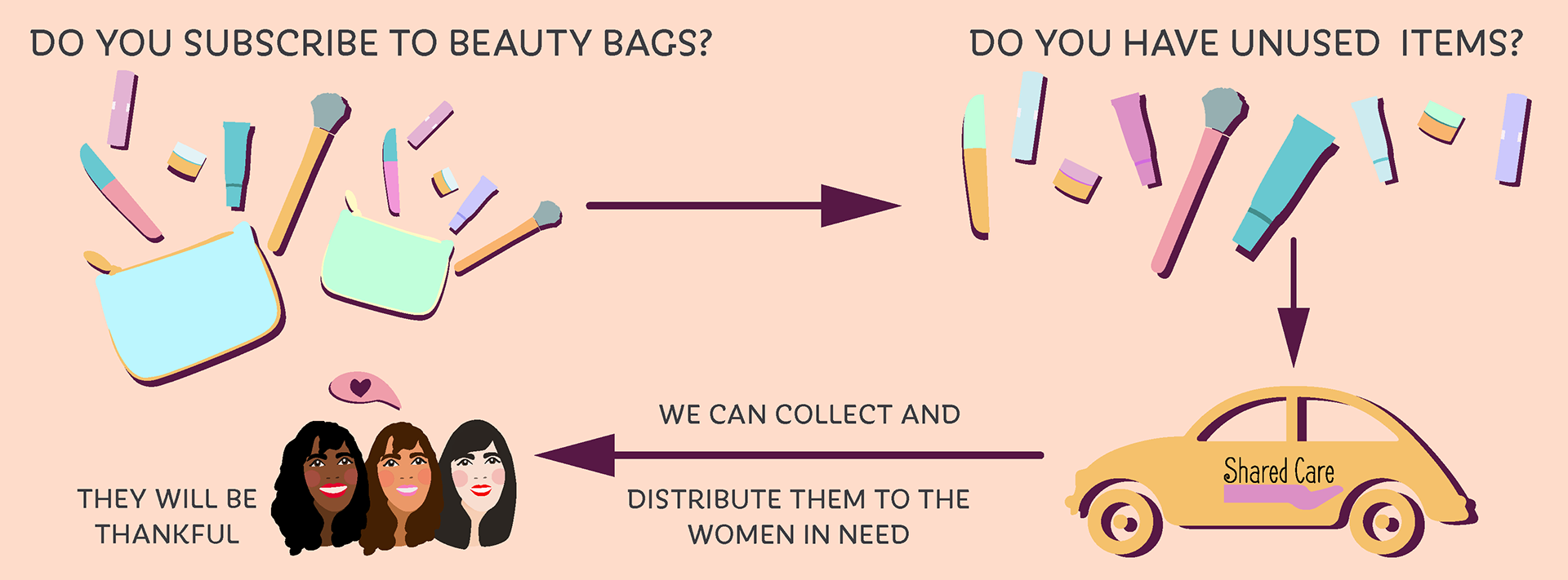
The old banner looked very dated, boxy and plain. The three woman were diverse but with few changes from one to the other. The shadows and the arrows are very prominent, taking too much attention. The arrows were too sharp, it seems that will hurt the girls.
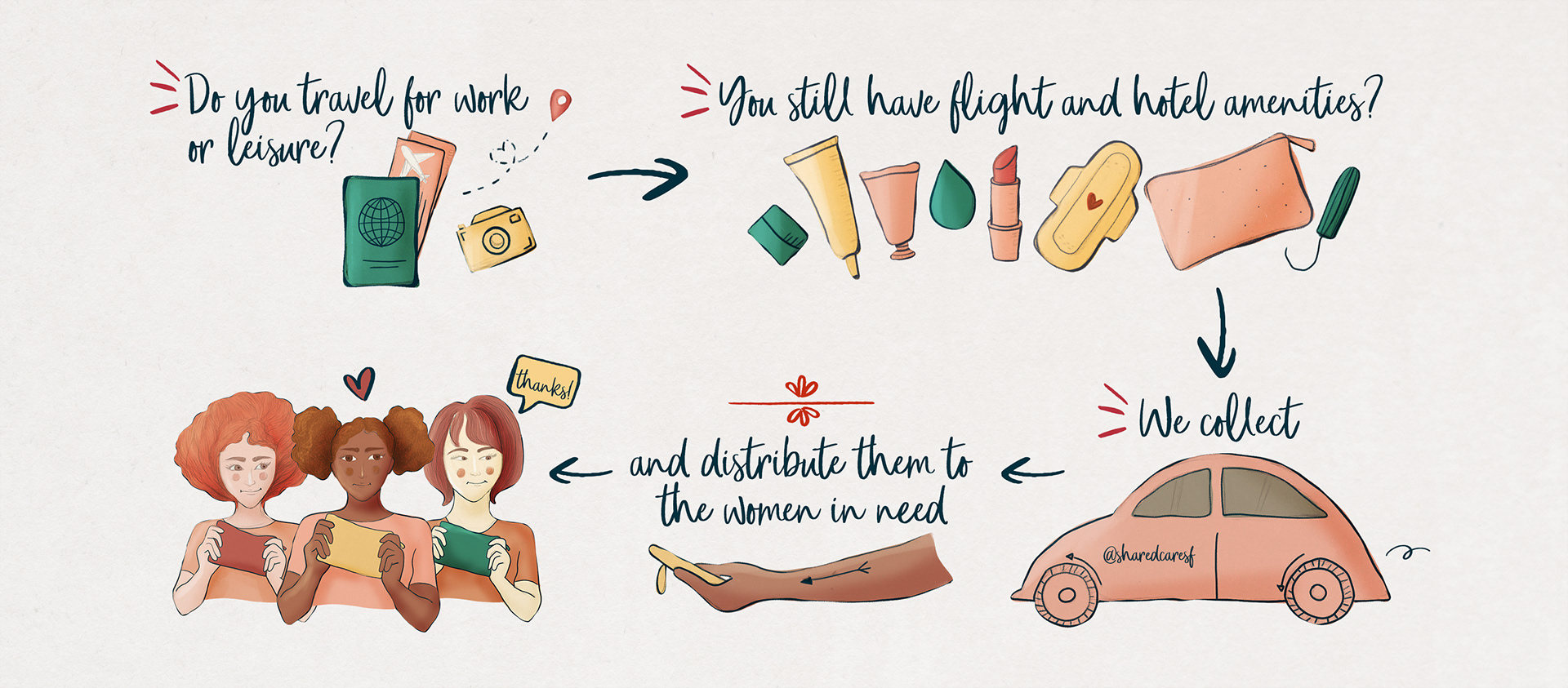
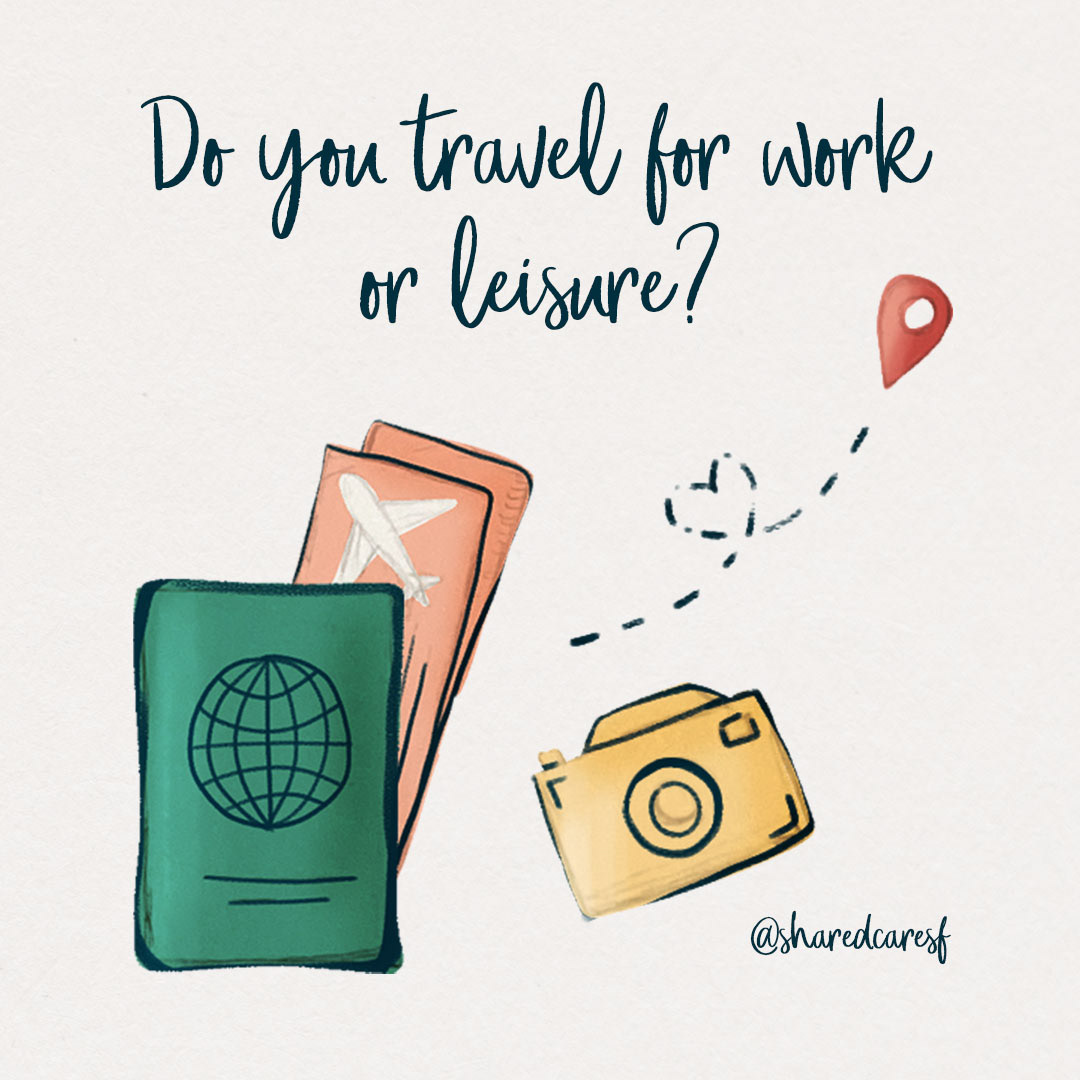
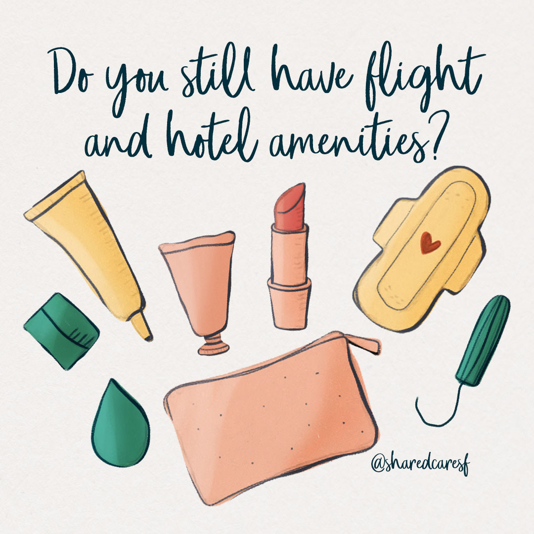
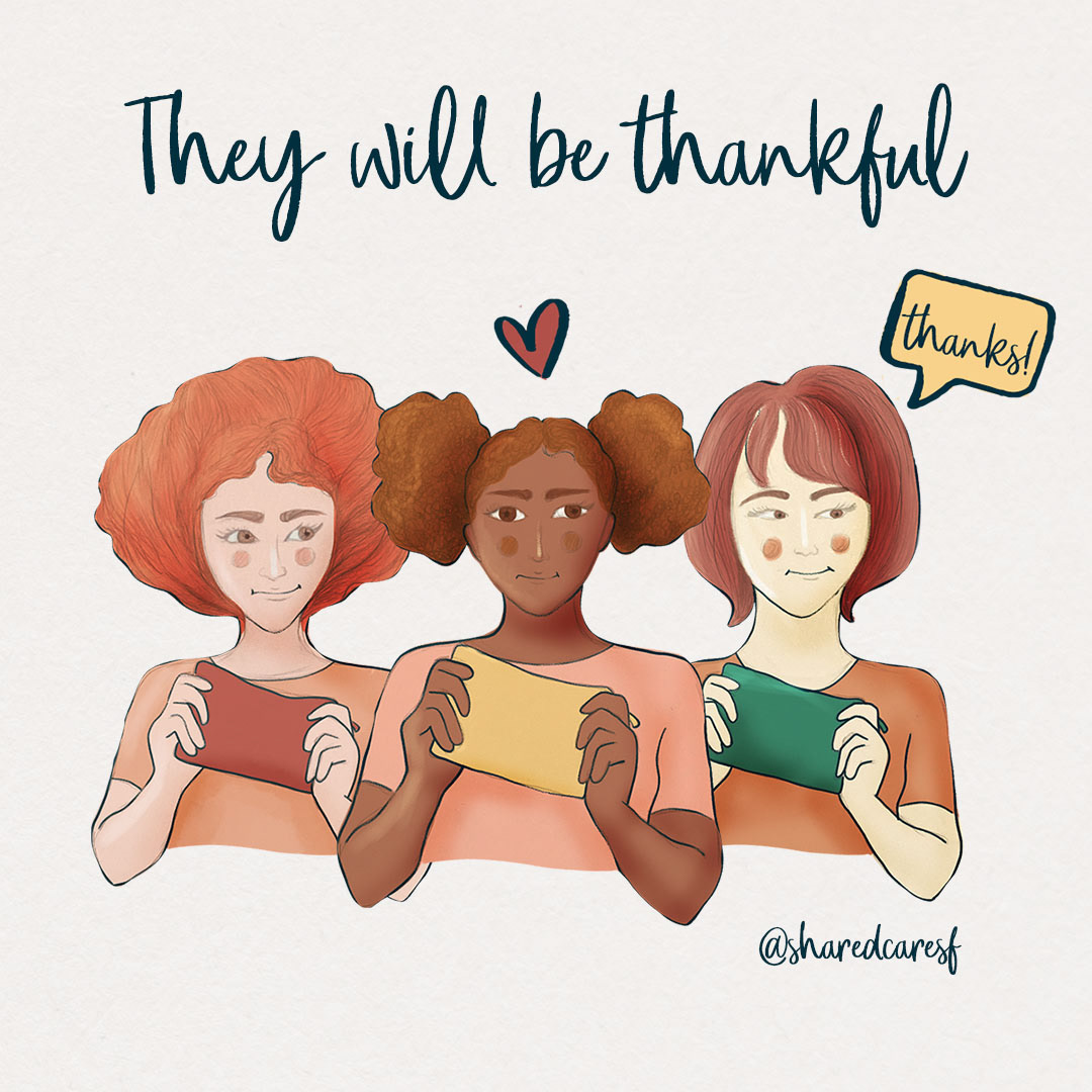
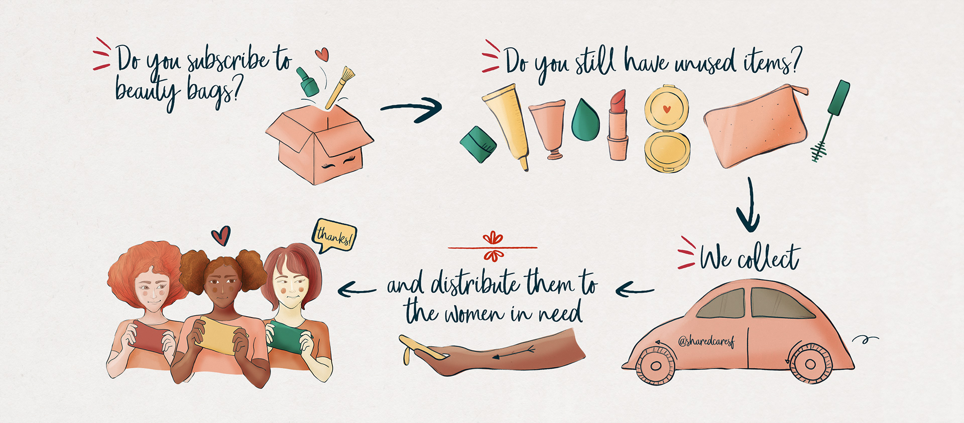
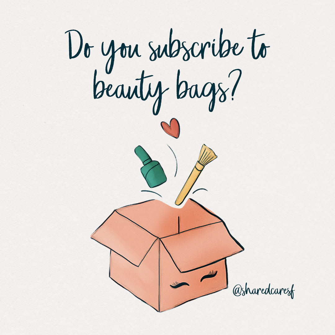
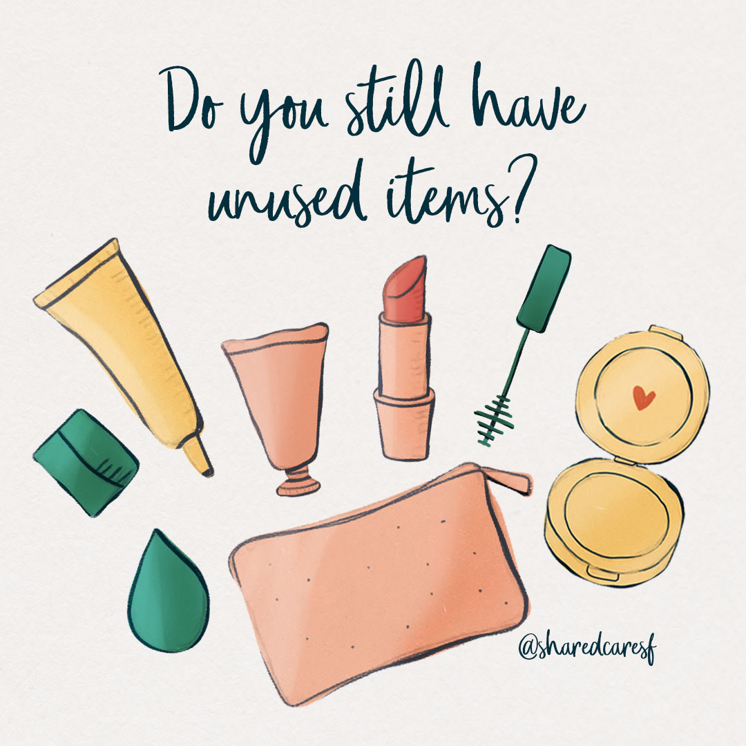
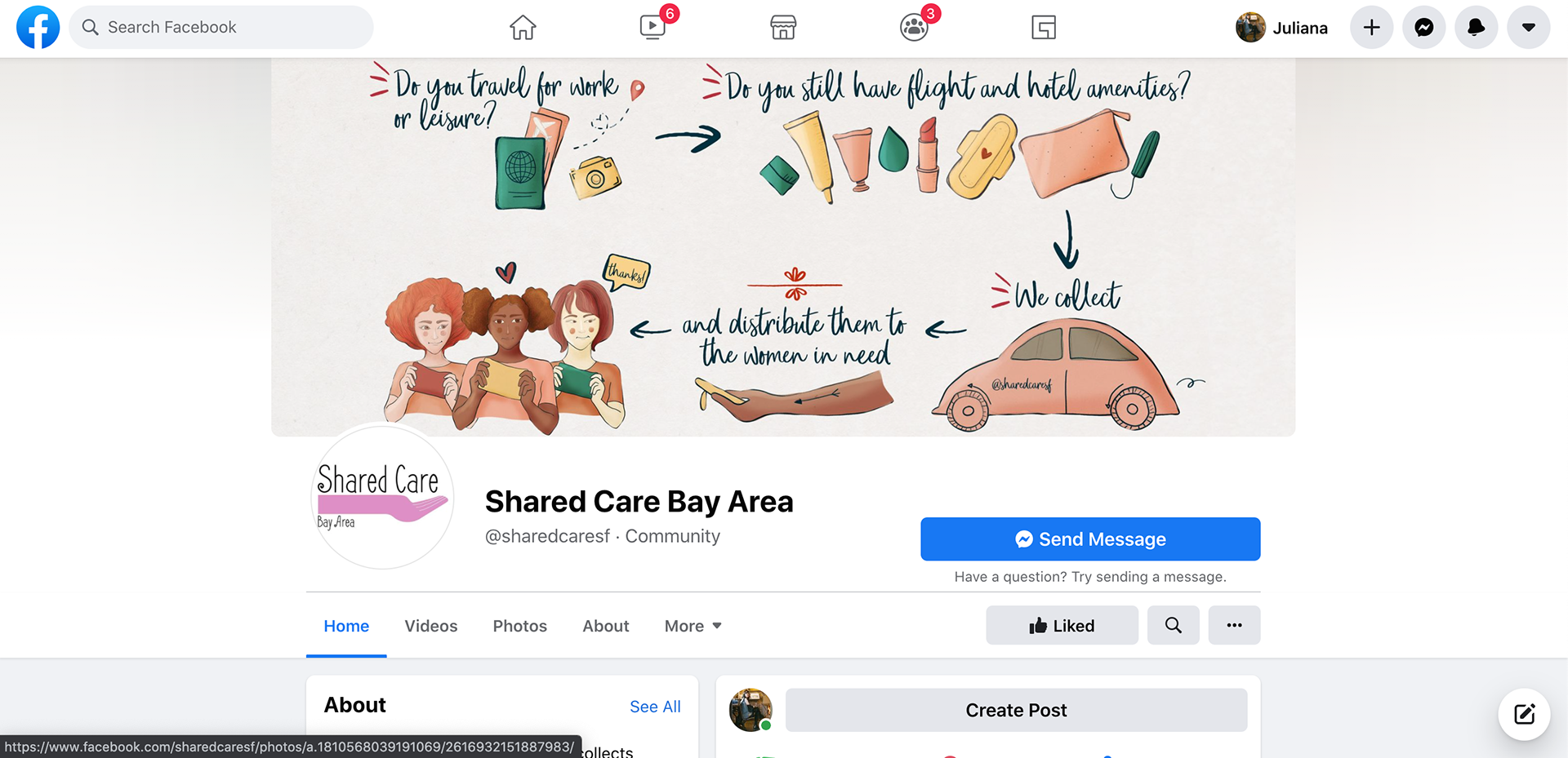
The new color palette is energetic, bright and friendly to reflect Raissa works since everything that she does is to bring warmth and freshness to these women in need. The arrows are more playful than the arrows in the old banner. The women are more diverse in the new one. And the overall design is more youthful, friendlier and full of personality which makes it possible to attract more people. For Instagram, I broken the banner into a carousel of four images that explains step by step of how Shared Care works.

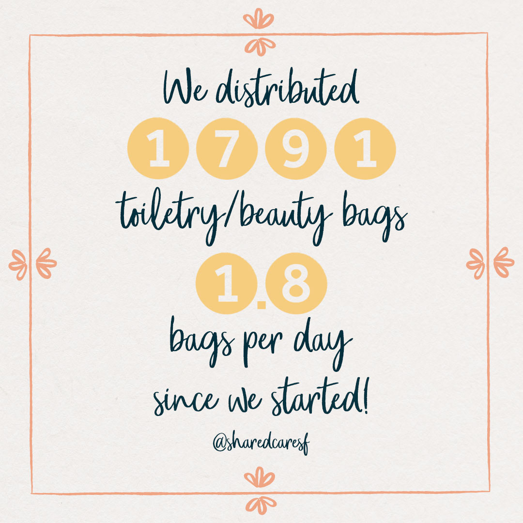
We created another version of the banner focused on the beauty products since they help these woman to boost their confidence. Through repeated elements, we keep the two designs cohesive.


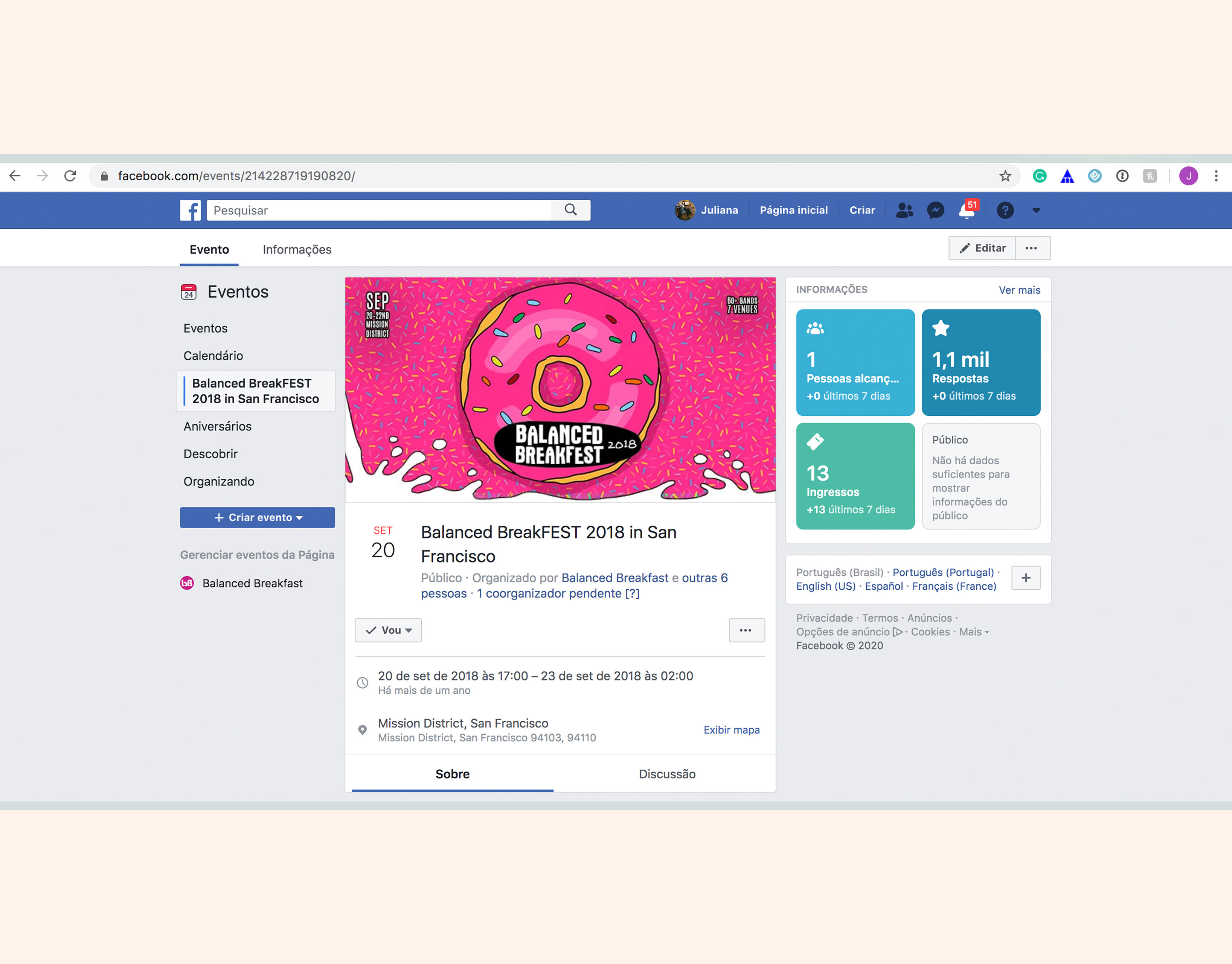
You can see how the banner looks like in use on the Shared Care Facebook Page.
To help Raissa to promote her project, I also designed a motion graphic with their tagline "We share, we care" and more content for their social media. See the template created to show how many toiletry/beauty bags Shared Care distributed since it was created by Raissa. It is easy to change the numbers and update design and keep the public aware of Shared Care work.