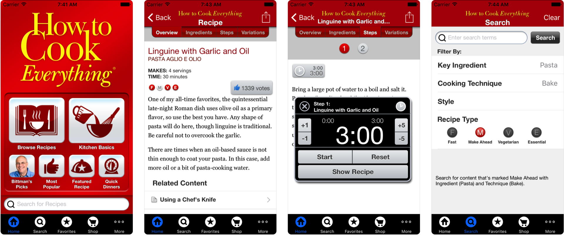
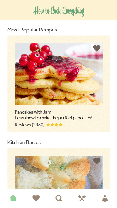
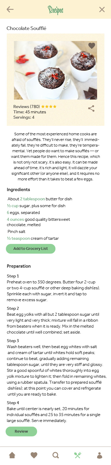
The current App wants to solve user cooking problems by teaching them how to cook everything. People need this app because they want to learn how to cook with Mark Bittman. Mark Bittman is the writer of the book, How to Cook Everything. But the big problem is that the App is looking outdated. Basically, the app was released in 2010. And the design didn't change since then. The app doesn't show pictures of the recipes which frustrates the user who wants to see how the dish looks like before committing some time to do it. It also has navigation issues. See below some screenshots.
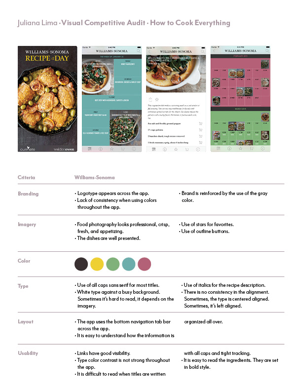
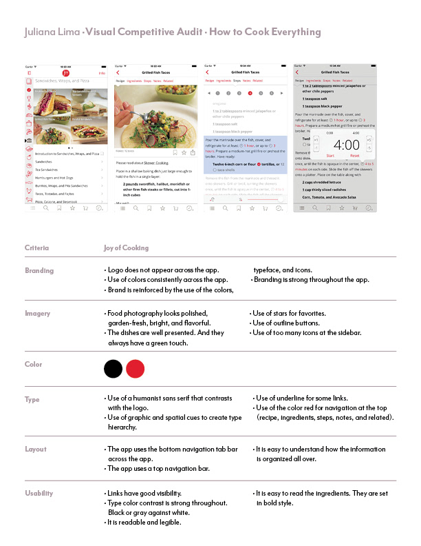
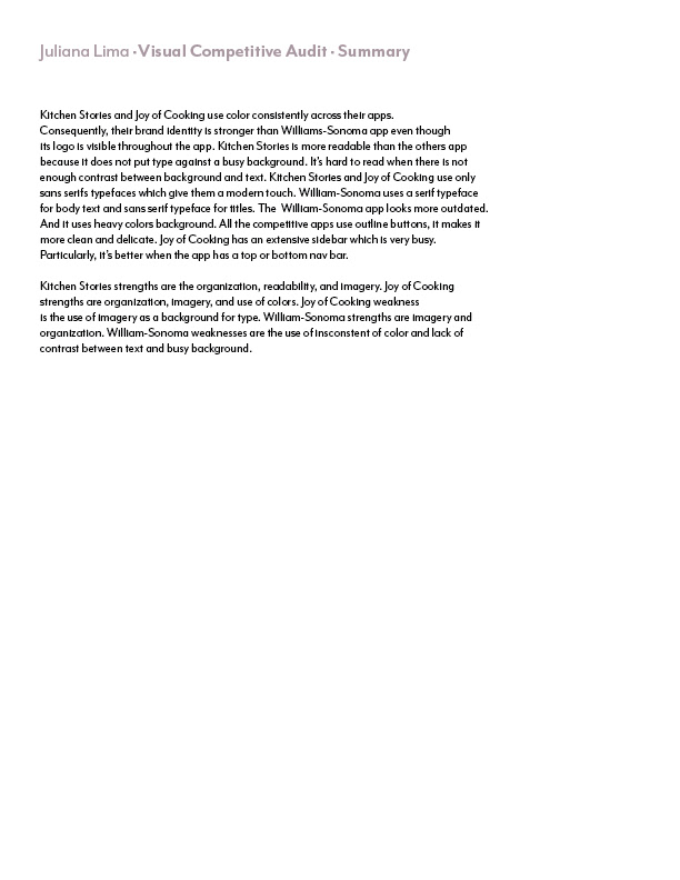
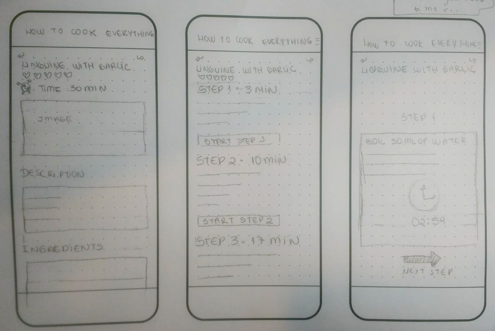
By analysing its competitors, I understood how different Apps solved the problem. I also could se how to design the screens differently. And I also could notice what the competition was missing. I also sketched the wireframes and created a paper prototype to check with the user if the changes in the navigation would make sense. See the process below.

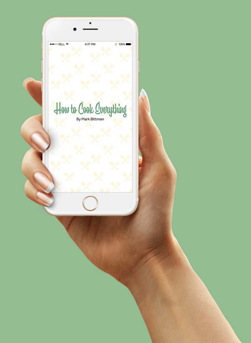
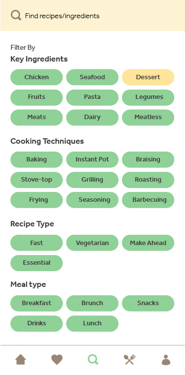
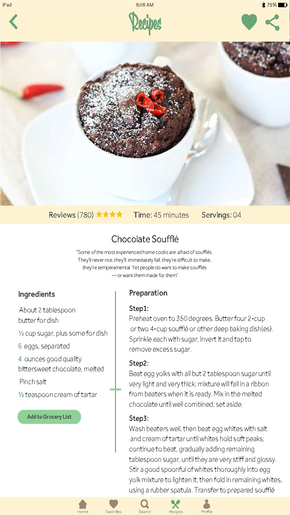
After I learned about the competitors and fixed the major navigation issues, I created a style tile to give me directions. I went for a vintage, fresh, warm look since the audience was people between 34-54. The vintage look is is reflected in the choice of the background pattern for the splash page, pastel colors, the typography for the logotype, and polaroid shape of the image frames. I chose pearl shape buttons and rounded icons to make it friendly. I also wanted that the design reflected Mark Bittman warmness.


See below how the app is responsive. The design changes accordinally to thescreen sizes.
Role: UI Designer
Format: iPhone
School Project