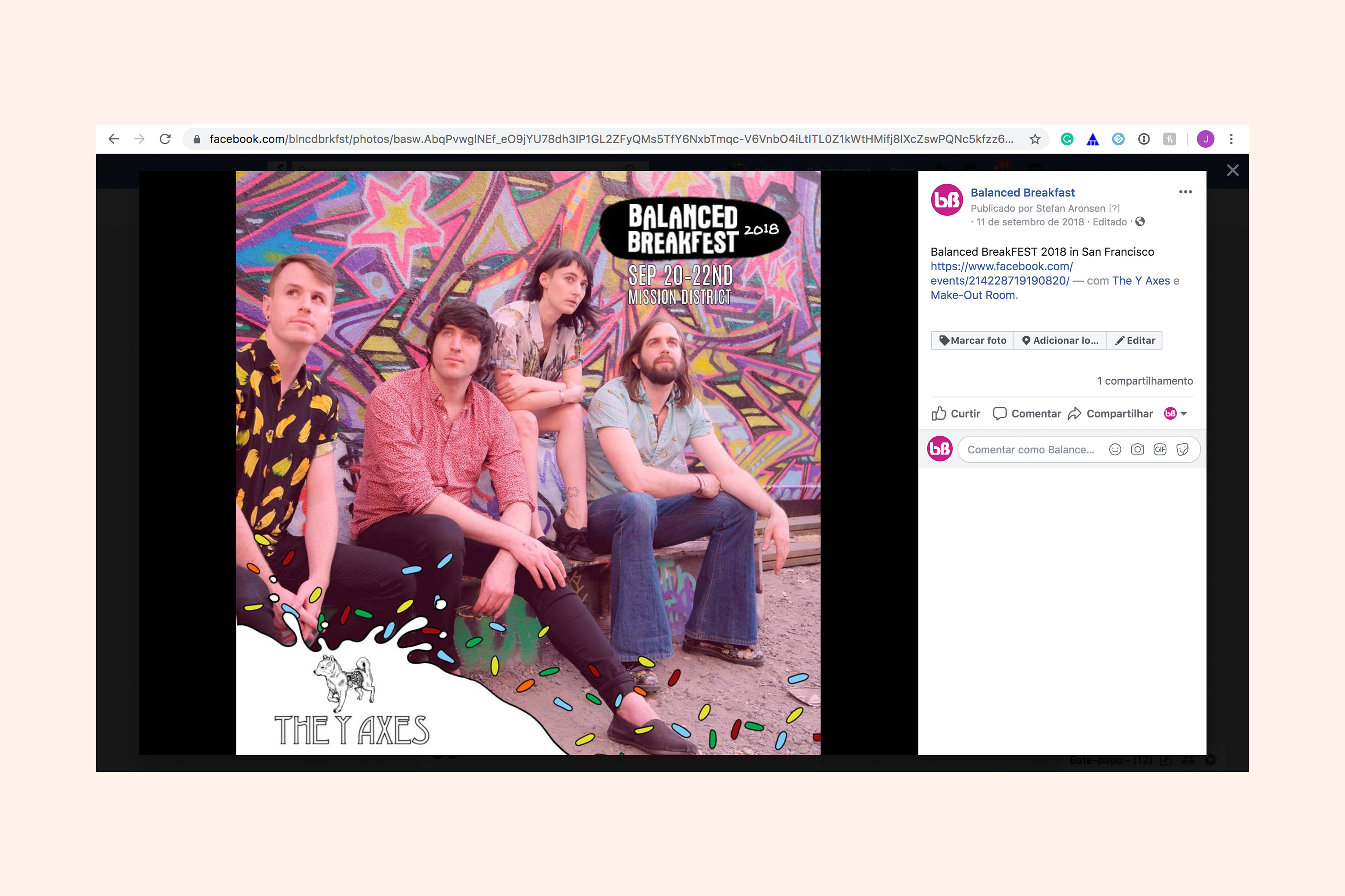
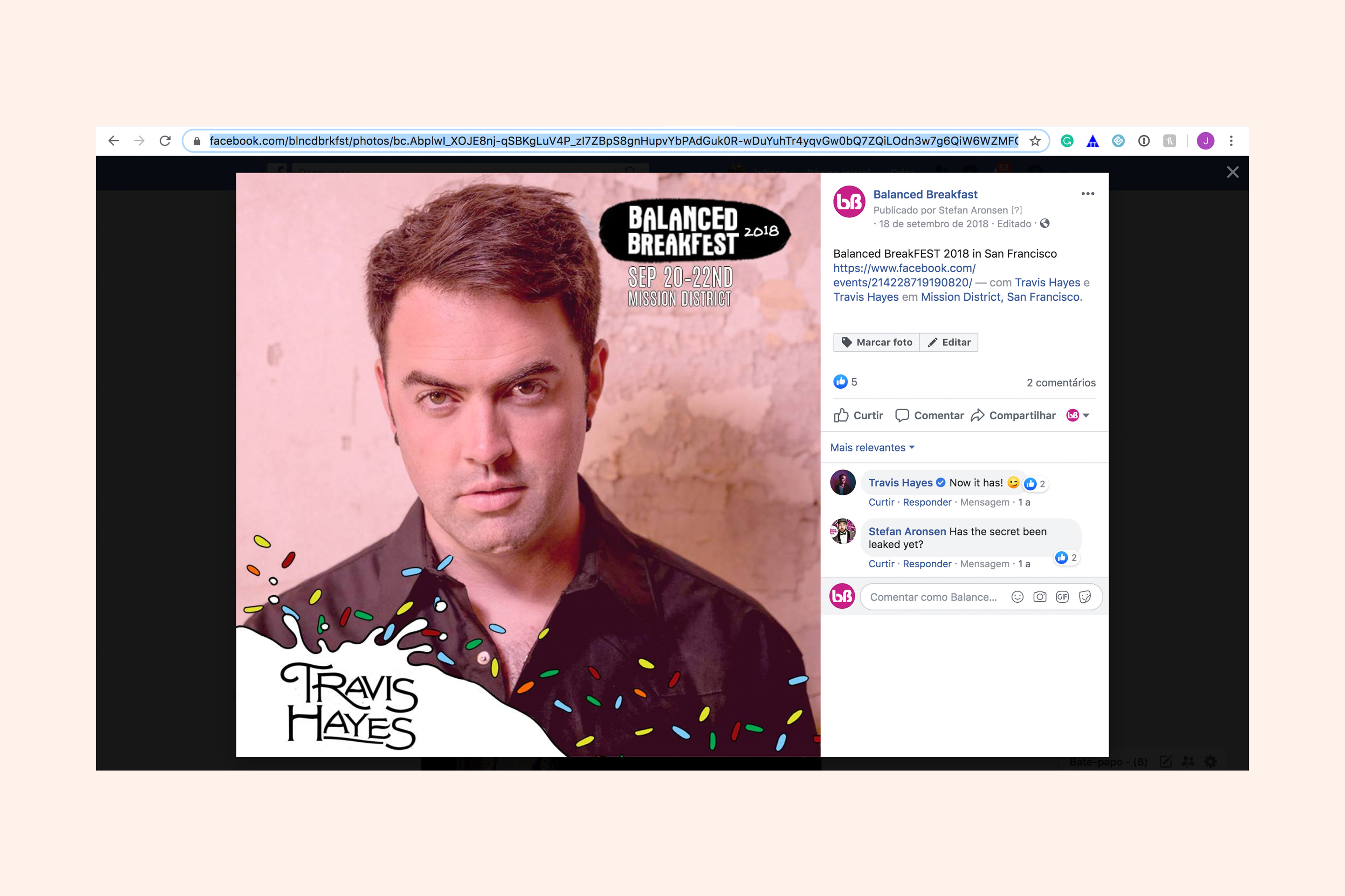
We created a filter to apply to the bands' photos. It gave a consistent look to the festival publications. You can see below how two different photos look visually integrated because of the filter. We also used repeated elements from the banner to make the campaign cohesive.
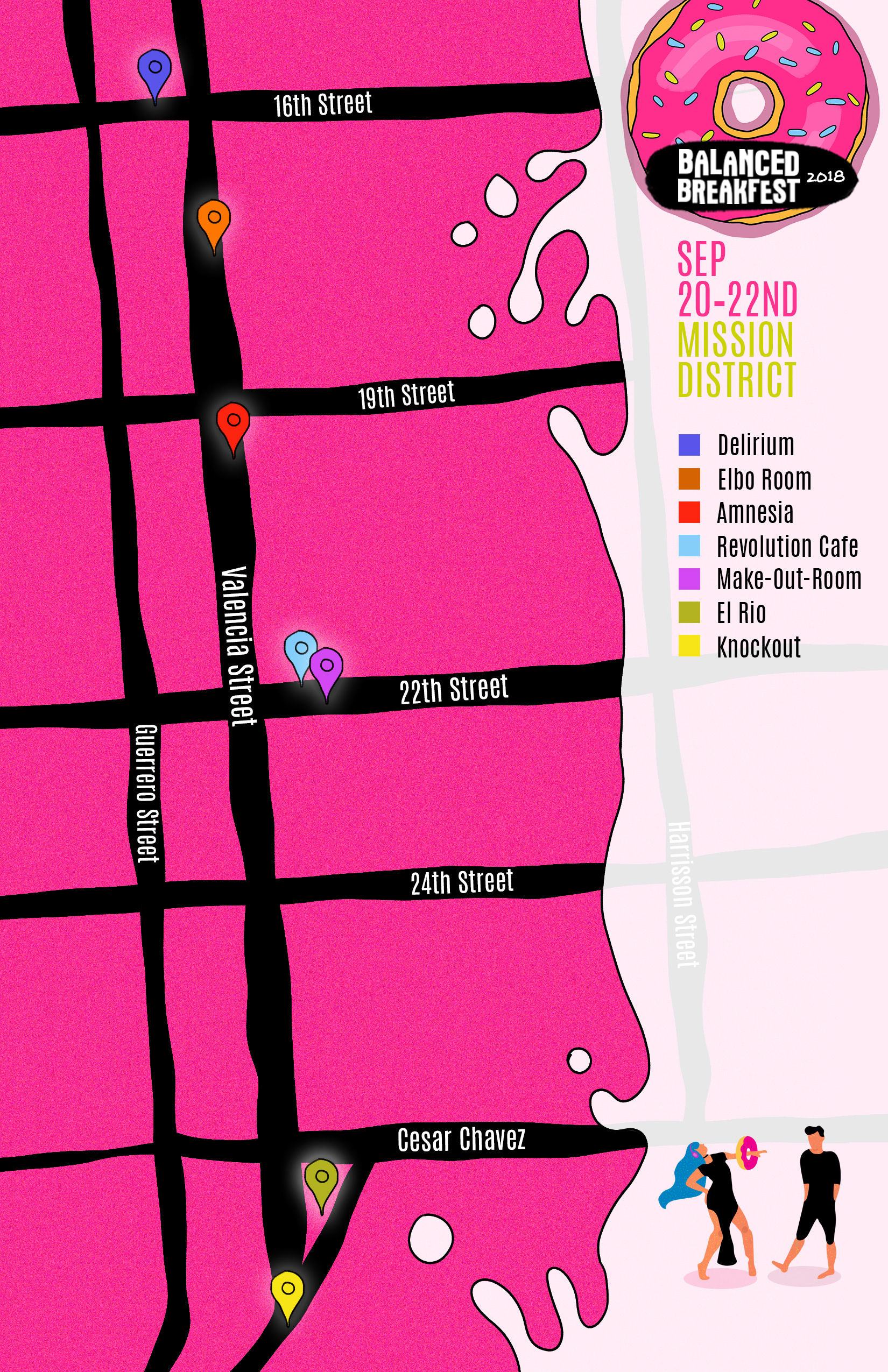
We also created a map to show to people that all locations were almost one block away from each other. And since you arrived at Mission District, you could walk around to see the different shows and enjoy the festival.
Role: Graphic Designer
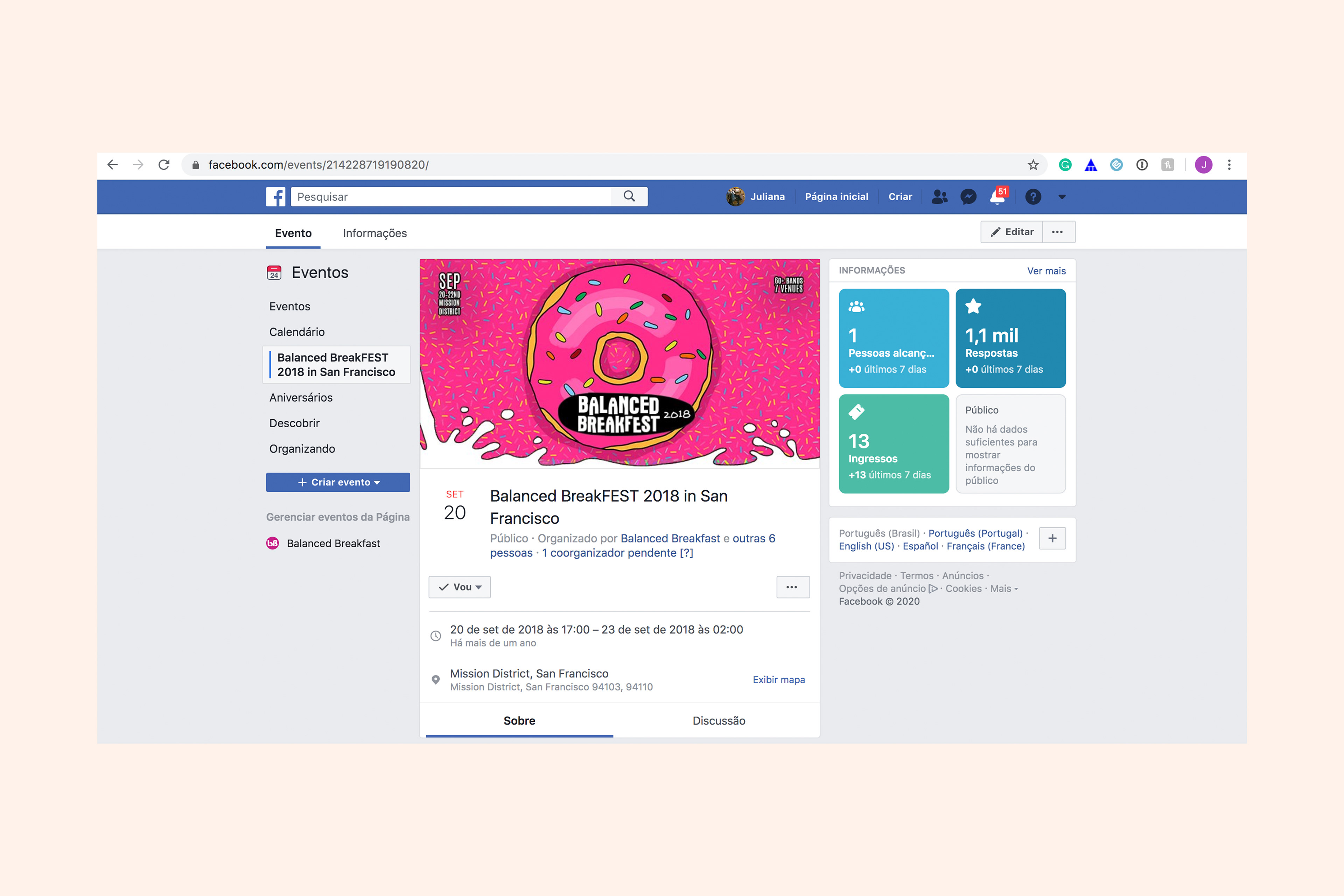
Client: Balanced Breakfast